We’re almost at Election Day, UMMA student blog readers! Each Tuesday until Election Day on November 3, we have been posting topics on democracy, voting, and justice in order to spark conversations about the upcoming election. In anticipation, the UMMA Student Engagement Council gathered to discuss Get Out the Vote: Empowering the Women’s Vote, an exhibition available online and on display at the Stamps Gallery until December 5.
Taking Them Seriously: A Roundtable Discussion of Get Out the Vote Posters
A Conversation with the UMMA Student Engagement Council
Transcribed by Anneke Bennison and edited by Emily Considine
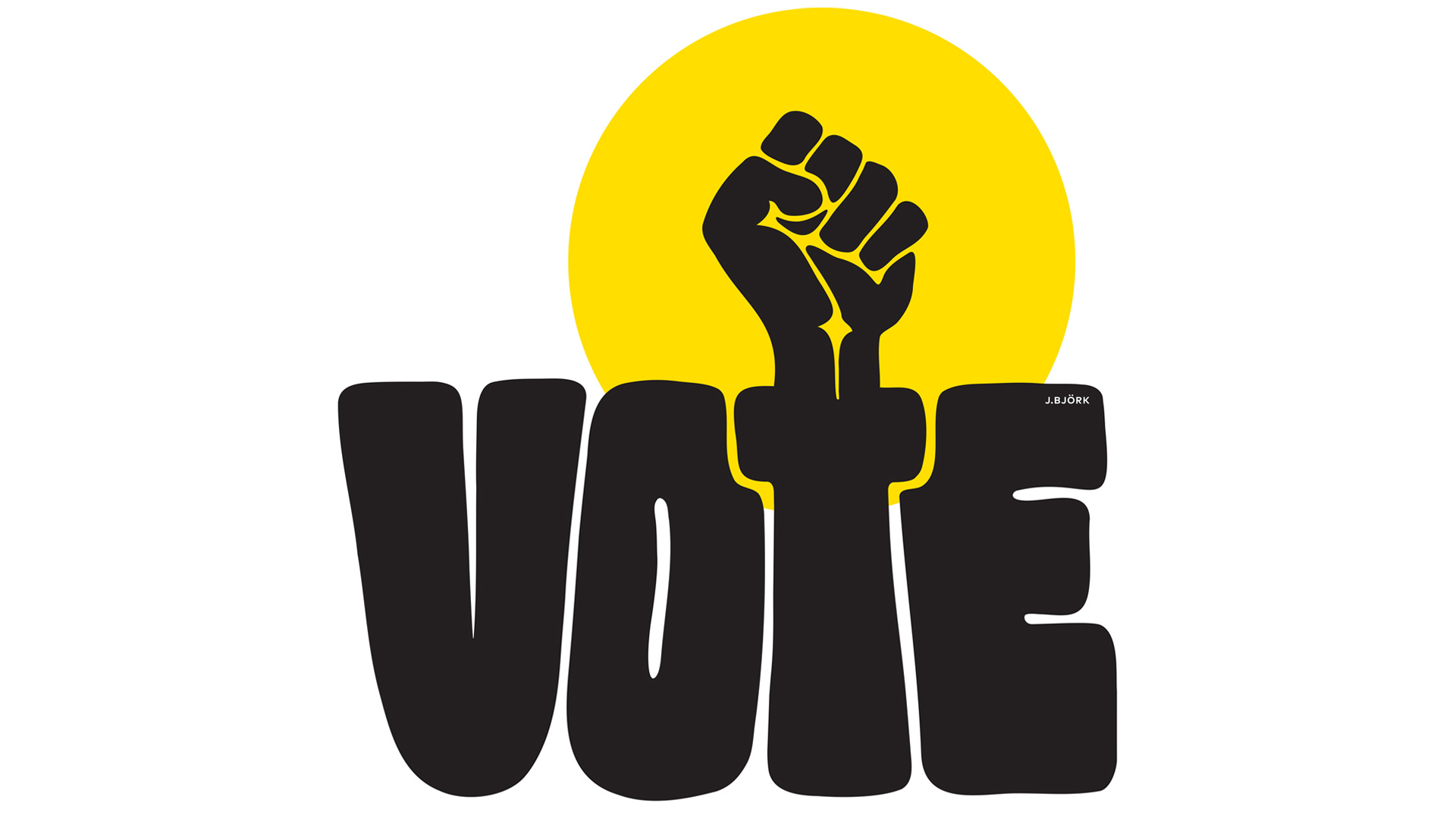
Poster design by Johanna Bjork
Get Out the Vote is a poster campaign organized by the American Institute of Graphic Arts (AIGA) in collaboration with the League of Women Voters. 65 artists were invited to make non-partisan posters that encourage voter participation. When the Student Engagement Council came together to discuss our thoughts on these posters, we all brought one or two of our favorites to talk about. The result was a roundtable that dove into the student perspective on a select amount of these posters, beginning with Shawné Michaelain Holloway and Nicole Killian’s Untitled.
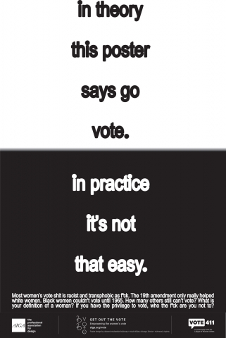

Emily: I liked that this one dropped a lot of conventions of design and it isn’t about patriotism. It’s not trying to put a positive spin on things or be subtle. It makes me think about what we write on this blog to promote voting and its tone and what we choose to say — so often it’s positive and hopeful, which is not a bad thing, but it’s nice to see some cynicism about why voting needs to be such a big deal.
Jake: I like that it’s literally just about voting and nothing else.
Sophia: This is the best one — it rewrites the dialogue of what these posters should be.
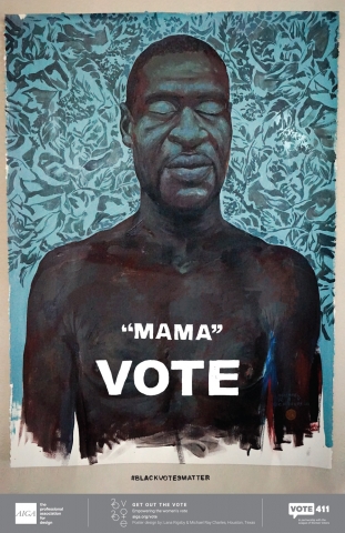
Jake: This is Lana Rigsby’s Black Votes Matter. I have a certain connection with Black bodies — we see them a lot and the media finds it okay to show videos of Black people getting killed but not white people, so to see George Floyd in a restful state surrounded by flowers is much better. The words on it really strike me, though. They remind me of my own mom. Lots of ethos and pathos in it.
Emily: I like that it’s hand-painted, it feels more personal.
Brooke: I like how the bottom of the painting looks unfinished. It adds to the idea that he died too young, that his life was unfinished. It’s not a complete work, it stopped at a certain point that feels inappropriate.
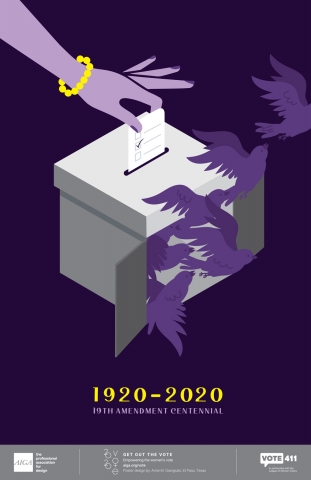
Sophia: I find it interesting to look at the different visual and word cues in the posters — the “visual vocabulary.” Gendering some posters is interesting, it’s highlighting the gender binary for women’s suffrage, like in Anne M. Gianguilio’s 19th Amendment Centennial and Annabelle Gould’s Empowering the Women’s Vote.

Emily: I always find it interesting how people choose to portray the idea of a woman in art because it can often turn stereotypical, even when you’re trying to do feminist stuff. Everyone’s instinct is to do something pink for women, but that’s not necessarily what you want.
Kilala: I agree. The idea of identity politics is stupid, like how masking and ignoring all the things Kamala Harris has done happens a lot.
Brooke: It’s hard to discuss, the poster’s got a lot of minute details and aspects to it. In one way, the decision to use purple and yellow — because they’re suffragette colors? — instead of pink and white, stereotypically feminine, tends more towards the politics side of the message and less towards the gender/feminine story. The hand is a bit bizarre. It feels bizarre but also how do you show a “female hand”? What is a female? Does it even matter? Do we have to include the pearl bracelet and nail polish, if it’s obviously about the 19th amendment? If it wasn’t there, would we know what’s going on still? Maybe we do need those, even if it’s outdated.
Jake: What if it was a different poster — agender arm hand, brown skin representation, white doves? What the doves mean would be something different entirely, especially with the context of this year’s election. Doves are the most eye-catching part for me. I grew up religious and doves are symbolic, maybe that’s why. But they’re my favorite part, like ushering in a new era.
Brooke: The concept of race is another important tool of what we get from this poster. The hand being purple makes it sort of racially ambiguous, which is silly because the 19th amendment only covers white women, so that identification is a bit strange. It’s all about the acknowledgement of mistakes — it feels irresponsible to have this when it didn’t apply to all women, women of color were banned.
Jake: I get irritated about the 19th amendment because it’s not when women got to vote, it’s when specifically white women could and everyone else was way later.
Brooke: This makes the pearl bracelet make more sense — it shows wealth and class. Which is like the poster with the pink coin — Karin Fong’s Untitled — that’s pink and white and has a white woman.
Sophia: It plays into larger art historical dialogue with liberty associated with women. But then the French used women for their stuff and didn’t depict real women.
Kilala: Everything’s from a man’s perspective in this world.
Sophia: The 19th amendment’s centennial ideal — put that aside for a minute. We’re able to criticize a lot of these, which is as important as having the posters themselves — we get the chance to have this dialogue because of all this.
Kilala: I think the most powerful poster is Annabelle Gould’s Empowering the Women’s Vote. The image is shocking — it’s not a political thing, but it’s shocking and radical in this context. I like how it’s minimalist, although some of the other posters had a lot going on but those were cool too.
Jake: It makes me think of the middle school “I Like Boobies” bracelets when I look at it. To some people, this might be uncomfortable — they’ll ignore the words, just look at the boobs and vote accordingly. The underlying message is really important, even though you have to shift your head to see what it says and look really closely.
Madison: I think women’s health care and health in general is often put to the side. Censorship of women’s breasts is a really big issue in the media — it’s a radical thing to see women’s breasts on TV or in movies when it’s literally just a body part, it is what it is. It’s a simple design but you know what it is and it’s eye-catching and the words are powerful. Women’s health isn’t in perspective because we live in a man’s world.
Sophia: Makes me think about infant mortality rates being high.
Madison: I find it funny that we pride ourselves on being number one in health care but we’re really not. Racism there — in infant mortality and women giving birth — is especially intense. Women of color aren’t as well respected by any means in health care.
Emily: I have mixed feelings about this one. It’s similar to those bracelets Jake thought of — it makes me feel weird. Coming up with the best icon for womanhood is a hard issue. I like it as a cheeky eye-catching thing, but the depiction of a woman based on just breasts is a bit off for me.
Sophia: It’s reusing this image of the female naked body that’s been exploited in history of fine art to create these images — sort of reclaiming this tradition that already exists and putting it in the context of all these hard parts of society, poverty and homelessness, et cetera. Because the dialogue already exists, they can use this female form and subvert and reclaim it to put the message on it.
Emily: I agree and that seems to be the intention of it, but this poster doesn’t come across as clearly for me because the text is so small. It’s not meant to be just male gaze-y, but it’s not as immediately apparent as it is with the Guerrilla Girls poster it’s similar to.
Brooke: Moment by moment, I have different feelings and reactions to it. I can’t stop thinking about how the center words are brownish and then it changes to white on the outside. Is it meant to represent race? It feels a bit silly. I can’t really take it that seriously — my own personal feelings get in the way. It reminds me of those shirts with line drawings of boobs, which is sort of *shrug* for me. I feel like I can picture the person that made this but I’m not sure how I feel about that.
Sophia: The introduction on the page says this is an “incredible opportunity to catalyze women in design.” Just looking at these posters for their visual design — how people are using different things to achieve a nice graphic image is a fun conversation to have — the variability is fun and whimsical. What are these aesthetics or creative mechanisms at play? I like it a lot.
Brooke: I like the juxtaposition of two posters. Meena Khalil’s Deeds Not Words, the flowers and lettering are expressive and it’s light and lighthearted, just says “suffragette” and “deeds not words.” Karen Kurycki’s Listen to Black Women, Then Vote has a message. There’s no visual, no flowers, no fun font, it’s just the words. Take them seriously. It’s something to read and think about and leaves no room for interpretation. Both say very simple things, and yet the suffragette one feels out of touch.
Anneke: Listen to Black Women, Then Vote looks like Black Lives Matter posters. It seems to be invoking that and it’s powerful.
Brooke: I don’t really get anything out of the suffragette one, it doesn’t seem to say anything.
Sophia: I think the suffragette one matches the interior design of a suffragette. You could hang this in your bathroom and feel like you’re doing stuff. It doesn’t do nearly as much as the “listen to Black women” one.
Emily: I think the “deeds not words” quote on the poster doesn’t make much sense – it feels disconnected. I like the flower design but I’m not sure how to take it in context.
Sophia: I think it ignores all the violence that went into the process of getting all women to vote in the last century — like Brooke, I think it’s just a bit out of touch.
Kaeli: My favorite is Voice Choice Vote by Laura Shoemaker. It’s simple, gets the point across. It’s not the most “woke” poster, but little kids always appeal to people. When you think about a little girl, you think about the “what do you wanna be when you grow up?” “President!” thing and you want that to be true.
Emily: It’s one of the only posters that uses photography.
Anneke: My favorite is The Boyfriend Loophole by Mary Maxwell Lane. It’s powerful in how it shows the information in the sights. It has a lot to say but doesn’t say it snappily, so it’s maybe not super effective as a quick poster but it gives information you wouldn’t necessarily have otherwise.
We hope you enjoyed our discussion of these posters. Two SEC members will be appearing on a free panel event in response to Get Out the Vote: Empowering the Women’s Vote taking place on Oct. 29 at noon Eastern time, which you can register for here. Check back in next Tuesday for our last post of this series. The content in this piece represents the opinions of its authors and not necessarily those of UMMA or the University of Michigan.